
16 Sep Accessibility: Visual Design Standards for Public Communications
Engaging the public doesn’t start at a public meeting; it starts the very first time someone sees a message from your team. Whether it’s a postcard, social media post, or flyer, your communications are one of the most important parts of capturing the public’s attention and encouraging them to engage.
One thing we need to consider when creating these communications is how to make them accessible to everyone, including those who are visually or hearing impaired. According to the U.S. Center for Disease Control and Prevention, in 2015, a total of 1.5 million people in the United States were blind and about 3.22 million Americans had some sort of visual impairment. A visual impairment means they had 20/40 vision or worse with the best possible correction (such as glasses). An additional 8.2 million Americans had vision problems that had not been addressed. The number of people who are blind or visually impaired is expected to double by 2050.
Below you’ll find some basic tips and guidelines for making your visual designs more accessible to those who are blind and/or have visual impairments. These are just a few of the ways we can begin to make our project materials accessible. Let us know of any other accessibility measures you use in the comments!
Don’t Forget the Font
The font you choose for your communications can help make your content more accessible. Using fonts such as serif fonts like Times New Roman or sans serif fonts like Arial, will help make your content visually easier to read. Harder to read fonts, like scripts and some stylized fonts, might be more compelling, but ultimately, they also might make your message unclear.
Another font factor is size. When creating materials, you have to make sure your font size can be easily read. For standard readability, printed documents should have at least an 11pt font. Presentations, posters, or meeting boards should have at least a 24pt font. However, as larger fonts make materials easier to read and more accessible, the larger the font size, the better. For print documents, you should use 18pt font or larger for visually impaired audiences. For more best practices for large print documents for those with low vision, check out these guideline documents from the Council of Citizens with Low Vision International and the American Printing House for the Blind.
It’s also important to consider the font size for items such as legends on maps or values on charts. Often, materials have small font sizes for these items, which can be detrimental for those trying to understand the visual’s meaning. When in doubt, increase the font. Not enough room on the page? Try to isolate your visual on its own page to enlarge it and make all elements visible.
Tailor Your Text
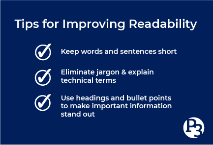
There are a few ways to help make text in your documents and visuals more readable:
- Use headings and subheadings to make important information stand out.
- Create numbered and bulleted lists to make your message easy to digest.
- Write at an 8th grade reading level or less: keep words and sentences short.
- Avoid using all caps or all bold fonts for large amounts of text.
Consider Your Colors
Colors can play a significant role in the readability and accessibility of your visual design. If the text color is white on a yellow background, it might be hard for someone to read it. When using colors, strive to create contrast between items so that one color stands out against another.
There are a couple tricks to determining if your colors contrast enough. The easiest way is to convert your design into grayscale. Can you still read your text? Is your image or chart’s message still clear? A more accurate way is to check the individual colors against each other. Use a contrast checker like the WebAIM website, which will give you a contrast ratio for your foreground and background colors.
Did you know that there are approximately 300 million people with color blindness worldwide? About 8 percent of men and 0.5 percent of women are color vision deficient, meaning they are unable to differentiate different color hues. To create accessible visual materials for these individuals, our designs should not rely on color alone.
When designing maps or graphs, label all your data points and add additional texture or pattern elements to visually indicate a difference between items. You can also use different shapes as indicators. This will help make these items more accessible to the color blind, as they will be able to understand the information that may have been conveyed by color alone.
When creating charts, it’s best to leave ample spacing between lines and add a background color to every other row to make the information more readable.
Describe Images with Alternative Text
Alternative text can be assigned to just about every online image. This text provides a description of images and graphics for screen readers to read to the visually impaired. When adding an image online, in a presentation, or to any other electronic material, type in a description of the graphic or image. If your graphic has a lot of text, consider linking the image to a readable pdf version.
You can also provide alt text and other accessibility measures on your social media images. Check out the American Foundation for the Blind’s guide on Social Media Accessibility Guidelines. It takes just a few seconds to add alt text to your social media posts, but those few seconds can make your posts so much more accessible to everyone.
Provide Visual Closed Captioning Your Videos
If the images of your video are equally as important as the auditory message, or provide additional information or context, you might consider including visual closed captioning. Visual closed captioning provides descriptions of the visuals in the video, giving the visually impaired a better understanding of the message.
Use White Space
White space can be extremely useful for designing a visually accessible document or graphic. Allowing for ample space between lines of text or space between different concepts makes text and individual messages easier to understand. Pages cluttered with text, graphics, and maps close together can be hard to comprehend. It’s better to add more pages to your handout and allow your content to breathe.
Our goal is to make public participation as inclusive and equitable as possible, and this includes making visual materials accessible to everyone. With the development of design tools, word processing applications, and other software, it’s our responsibility as engagement professionals to continue to update our thinking and knowledge about accessibility factors. Hopefully, you now have some new tools and guidelines to follow while creating your next project’s materials.
What are some accessibility factors you consider in your projects? Let us know in the comments below!
TL;DR
Want to be notified when we release a new blog post? Subscribe here. And don’t forget to follow us on Facebook and LinkedIn!
About the author: Deirdre Scanlon is the Communications Manager for Public Participation Partners (P3). When not dreaming up new ways to equitably engage the public, you can find Deirdre tending to her houseplants or walking the trails of Raleigh, NC.
Sorry, the comment form is closed at this time.